
Painting lesson post 3
I have been having painting lessons for a couple of months now. I started because I wanted to do something different, avoid burnout and get out of the house a bit more ( I am an online teacher so the last ‘goal’ was really important). I have really been enjoying the classes and while I definitely am not a first class talented painter, I am quite pleased with what I have done so far. One more reason I decided to start painting was because I wanted to challenge myself. I am colour blind and painting for a colour blind person is……….pushing it.
When I started painting lessons, I struggled, but yesterday’s lesson was great and I learnt a lot about colours and how to match them. I now look at colours as if they are math. Yeap, you read correctly, I said maths. While I am unable to actually ‘see’ the colours, I think I can now paint without knowing what exactly I am using.
Lists, numbers. Red + blue=purple
My painting teacher sat with me and we wrote down the names of all the colours and the corresponding tube numbers. Before moving on, I need to say that the batch of colours I have has the names of colours written in funny names (or is that Italian?) So, for example, when a tube had the name ‘Siena Bruciato’ and the number 3 on it, I wrote: this means a red, orange, browny colour- number 3.
My list of colours was ready. My teacher then told me how to use colours and which colours are warm and which are cooler tones. Warm colours in painting are red and yellow. Blue is a cool tone. We use warm colours in the foreground, and cool colours in the background of paintings. You can make a colour cool or warm depending on how much paint you use when you are mixing colours. So, if I want to use purple for example, and I want it to be a cool tone, I use more blue (background colour), if I want it to be warm, I use more red (this will pop out in a painting). I also learnt that green is a neutral colour. White is used to make lighter versions of a colour (something like toning down). There are different types of whites and the best one is Titanium white (don’t ask me why, just accept it, welcome to my world) and black should be avoided. If you want to use black, it’s better to use a dark blue.
So, now I can paint without being able to ‘see’ the colour. The only difficulty I have is making the same shades of colours from one painting lesson to the other. You see, I cannot measure the drop of paint that goes into the colours, so if I put red and blue together to form purple, I won’t be able to make the exact same colour next time, cause I won’t be able to ‘see’ the colour. I have two solutions for that, one I have already tried the other is a thought.
Solution 1= make a shade and use it all in one session. Finish painting whatever you have started with the same blob of colour.
Solution 2= I need to invent some sort of paint measuring device. The only thing I can think of is either a spatula that is used to put make up on or the thing we use to measure medicine, but then my whole painting is like math will turn to painting is like chemistry so I would probably have to rewrite the whole post. That’s why I am sticking to solution 1.
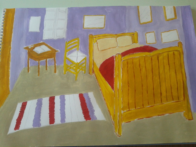
My 1st painting. I have strayed from the original Van Gogh. This is Jo’s room. It still needs work. Painting is hard 🙂
Till next time………
